Hi there, we are Sophie and Emily from the Glasgow School of Art, where we study illustration and graphic design respectively. We have recently created the Shelter Scotland 50th anniversary logo, which was chosen after 60 third year Communication Design students submitted concepts for an internal competition, which was judged by tutors and Shelter Scotland. This logo project is part of a unique partnership between Shelter Scotland and the Glasgow School of Art. The 50th logo will be used to brand their 50th website and a 12-month series of 50th events and activities.
We’ve been invited by Shelter Scotland to give some insight into the work that went behind the creation of their 50th logo.
When we were originally starting to come up with the idea, neither of us really had any experience with logos, but we had a few workshops at the start of the project that introduced us to the process of creating a small succinct image that captures a particular message. And that message was the 50th anniversary and to spread the word that this was not a celebration, but a marking point of Shelter Scotland’s continued journey to fight for fairer housing. It was also an opportunity to try and showcase different aspects of Shelter Scotland’s activities that the public might not know about. So, obviously it’s quite a bit to digest into a single image.
We started off the process by getting out all of our initial ideas onto paper, all of the number 50’s and the red houses and the people holding hands. The amount of shape combinations and slight adjustments that you can create with simple elements is amazing and also incredibly frustrating. But when working as a team you get through the ideas twice as fast and we began to create a system of drawing and redrawing each of ideas again and again. One person would have one idea that spurs on the other person to think of something new and so on. When one of us would come up with an idea that the other couldn’t picture, we would then work together to come to a compromise or developed it to a point where we could both envision the logo. There was a lot of teamwork and creativity in the initial processes of finding ideas for the logo.
There were many points over the course of the first week where we were short of inspiration and one of the things we were a fan of was the book ‘Symbol to Logo: Polish Graphic Marks’, which is a vast collection of Polish design history from 1945 to the present day and provided a wealth of information on how designers communicate complex ideas into graphic shape and text. We chose a number of different logos in the book that we just genuinely liked and looking through the logos gave us a lot of different ideas and examples of how logos could be created and altered. We definitely recommend you check it out!
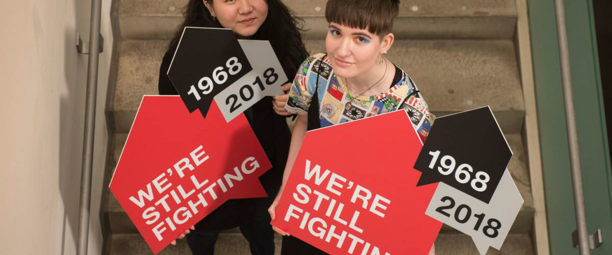
It was not too far into the project that we came up with the initial stages of what is now the final logo. It started from an image of one person, or a group, with a speech bubble house above them. It had what we were looking for – a sense of urgency, of communication, of a call to arms. The next stage was just a happy accident – like most things in the design process – where we were trying to get a house bubble shape we liked, we realised that the bubble alone was a clear enough message.
Now that we had the framework, the next chunk of work on the logo was finalising the copy, the usage and the composition. What would it say? Was there only one bubble? What would happen when more are introduced? Does it alter the message, improve it? How do we use colour to further enhance it?
We first used the slogan ‘Housing for All – We’re Still Fighting’ and tried to incorporate this slogan in just one bubble, trying out different compositions and ways to showcase the slogan as best as possible. However, after discussing with peers and our tutors, we eventually ended up with only the slogan of ‘We’re still fighting’ because this particular part was enough to highlight Shelter Scotland’s 50th anniversary. We also added two more bubbles to add in the dates of Shelter Scotland’s 50th anniversary – 1968 to 2018. With these three bubbles, we tried different compositions and layering to get the best combination.
We took a long time trying out different compositions and combinations to come up with the final outcome. There was a lot of discussion and feedback from tutors and the staff of Shelter Scotland as well, which definitely helped us finalise what we needed to take our or keep. It was definitely an experience we both enjoyed and engaged in, despite it being challenging. We hope you enjoy the logo and hopefully, will be able to see the message and work that goes on behind Shelter Scotland.