If you receive our emails*, or follow us on social media, you’ll probably have heard that this year is Shelter Scotland’s 50th year of fighting for a home for everyone.
We can’t believe that, 50 years after Shelter Scotland was formed, we still see people suffering appalling housing conditions every day. We know that if everyone was aware of the grim realities some people have to call home, there’d be the same public outcry that led to the formation of Shelter Scotland 50 years ago.
That’s why we’ve teamed up with the prestigious Glasgow School of Art: to shine a creative light on the housing issues that are, tragically, becoming all too common.
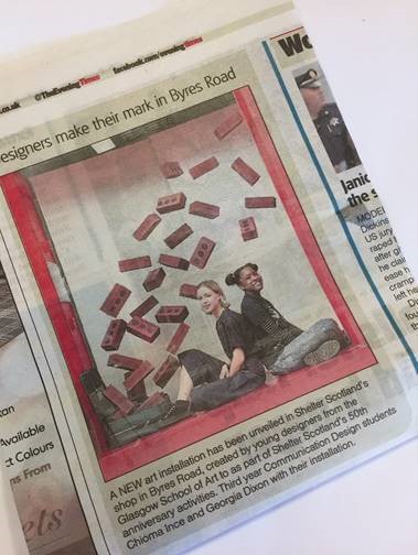
The first task given to the bright young minds at Glasgow School of Art was to create a logo for our 50th year, and the designers outdid themselves. We then asked the students to create shop window designs; something eye-catching, innovative and relevant to our 50th year. Something to make passers-by stop and stare. The two winning designs were installed in our Byres Road (Glasgow) and Nicolson Street (Edinburgh) shops for a week, and enjoyed fantastic media coverage.
We’re so impressed with how the young designers managed to highlight different issues around housing and homelessness, and show why we are #stillfighting until there’s a home for everyone.
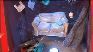
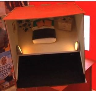
Nicolson Street shop window design
Designers: Daisy MacDonald and Catriona Wastell
Daisy and Catriona explained their design; “By posing a simple and direct and bold question “Where do you sleep?” alongside three different sleeping environments, which you can see in each of the boxes, our design concept seeks to raise questions for the public about their sleeping situation and what they/we all take for granted. The artwork also delivers key facts about homelessness in the side window of the shop and concludes with a direct call to action for us all to unite and change the status quo.”
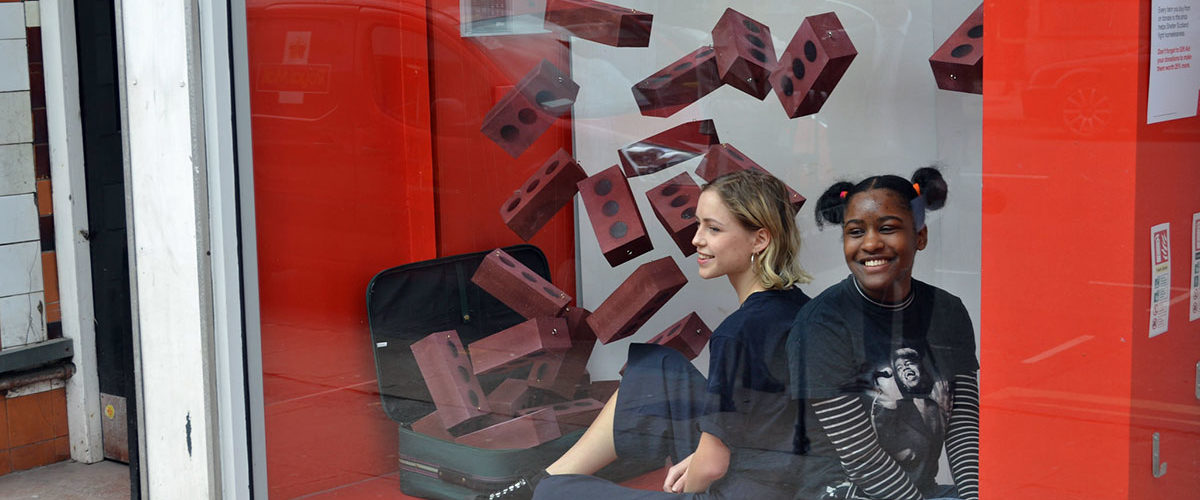
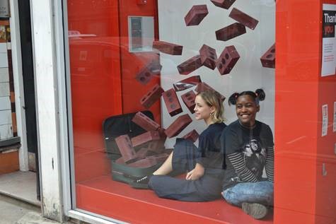
Byres Road shop window design
Designers: Chioma Ince and Georgia Dixon.
Chioma and Georgia explained; “Bricks can easily be understood as a metaphor for home and security. Our idea was to symbolize the progression from temporary housing, represented by a suitcase, to permanent homes, represented by the escalating bricks. The dynamic and theatrical nature of the display provides an eye-catching narrative and should intrigue the viewer offering Shelter Scotland an opportunity to start a conversation with potentially new supporters and volunteers. “
Also installed in all 37 (!) of our charity shops…
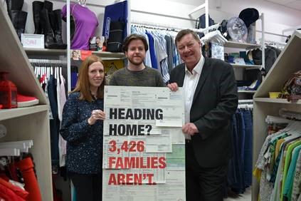
One other design, created by Claire McNally and Andrew Johnston, is featured in every single one of our shops.
Claire and Andrew discussed their hard-hitting installation; “Our design is intended to overwhelm the viewer by layering a variety of real financial expenses as a way to represent the common reality that many people face: the financial struggle that often contributes to homelessness. This approach is complimented by simple copy that directly addresses the passing public asking them are they ‘Heading Home?’ and then delivering the stark fact that sadly 3,426 families in Scotland aren’t.”
See more photos on our Instagram.
We’re so thrilled to be partnering with Glasgow School of Art, and can’t wait to see what these talented designers go on to achieve!
You can find out more about our 50th here, including the many ways you can get involved.
*If not, why not? You’re missing out! Sign up here, or follow us on facebook or twitter.


